 In Part 2, we reviewed economic data and saw that the recovery in aggregate for the US has been very strong. This is not to say all industries have recovered. Still, there are concerns in particular with small business and continuing and new unemployment claims. Let’s turn attention now to the market valuations and discuss where there may be relative value.
• Low interest rates and stimulus have caused asset prices to inflate
• Going forward, future returns are likely to be lower, for both stocks and bonds
• Inflation in stock prices has been highly correlated with future earnings rebounds
Low Interest Drives Lower Future Bond and Stock Returns
US Treasury rates have dropped significantly from one year ago. The entire yield curve is lower. The Fed is forecasting inflation in the 1.6 – 1.7 % range over the next few years. So, real return for these securities is negative.
| 1 Year ago | Today’s Rate | |
| 3 -month US Treasuries | 1.66 % | 0.09 % |
| 10-year US Treasuries | 1.80 % | 0.80 % |
| 30-year US Treasuries | 2.29 % | 1.60 % |
The case can be made that expectation of a full recovery and an expectation of long-term low interest rates largely explains why the US stock market is priced higher than it was before the pandemic. This is simply discounted cash flows at work.
Under a scenario where interest rates have permanently shifted down, we could see future returns lower for both stocks and bonds. Although US stock prices are higher than they were a year ago, the higher PE would be justified based on lower long-term interest rates. Think about the 1980s and 1990. In 1984, the 10-year was yielding 11.55%. As an investor, of course we would only buy riskier stocks if the forward return expectation was above 11.55%. Recall that the PE ratio for the S&P 500 in 1984 was 10x give or take. So, it had an earnings yield of 10%. The PE today is ~30X for 2020 and 21X for 2021, based on operating earnings estimates (source: S&P 500 Dow Jones).
Bond Market Segments and Forward Returns
For bonds, let’s look at the current SEC yield by sector to discuss relative value. In the next plot I am showing SEC yield on the y-axis and risk (as measured by standard deviation) on the x-axis. SEC yield is the most recent dividend return, annualized.
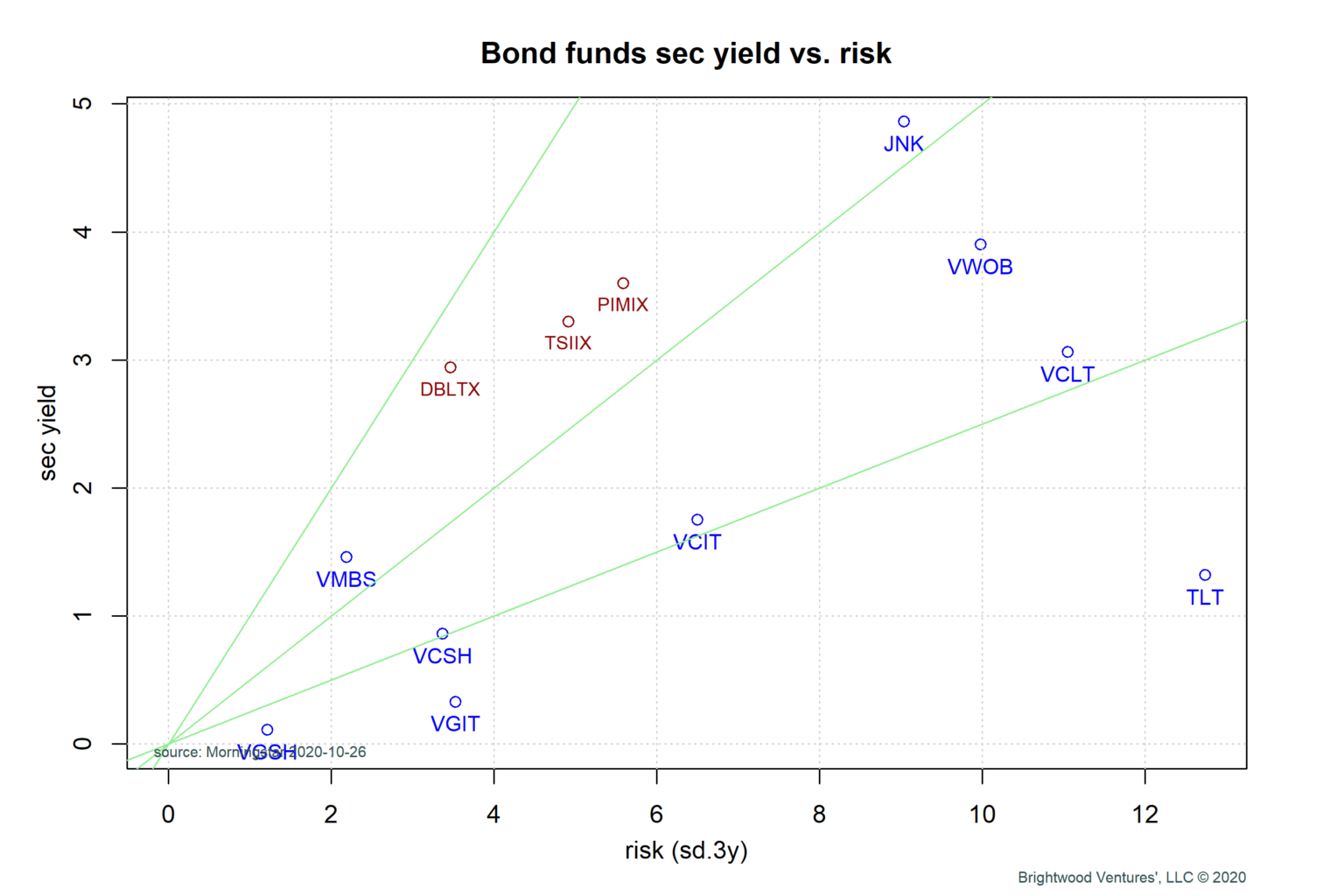
All of the points on this chart have moved down and to the right compared to one year ago. SEC yield for credit bond markets (such as corporate bonds and foreign government bonds) generally trade at ‘spread’ to government bonds to compensate investors for extra risk.
In the chart, I have a selection of exchange traded funds (ETFs) and a few bond mutual funds to illustrate current yields by sector. Generally, we want to consider bond sectors or funds with the best forward returns for a given level of risk. The green lines just provide an indicator to compare bonds on a risk-adjusted level. Again, we’d prefer categories that are up and to the left of other categories.
Government bond funds with short term (VGSH) and intermediate term (VGIT) are offering very low returns. Traditionally, owning government bonds has been a nice hedge vs. stocks in that they can be expected to go up when risk assets fall. However, with such low rates, this strategy no longer looks attractive. These bonds are yielding less then inflation forecasts and probably don’t have much upside potential should we get another market correction.
Generally, I am also inclined to avoid long duration bonds of any kind. Why? Bond values fall when interest rates rise. Long-term bond yields are compressed and don’t offer much additional return for taking on the added interest rate or duration risk.
So, what does look attractive? Although yields are low, I do like government mortgage backed securities (VMBS) and short-term (VCSH) & possibly intermediate term (VCIT) investment grade corporate bonds.
Finally, let me say a word about the multi-sector bond funds. I included three that have a good track record over 3, 5 and 10 years. These funds invest in multiple sectors and also have access to certain bond strategies not available in a passive sector type ETF bond fund. I use statistical analysis to determine if a particular fund is generating any excess return, after accounting for extra risk such as credit risk and interest rate risk.
US Stock Market Relative Value Discussion
For stock I want to use a different chart to discuss relative value. There are many ways to evaluate relative value and for brevity I am going to use my single favorite chart. This chart plots the forecasted earnings growth on the x-axis and it plots PE ratio on the y-axis. The idea being that stock and stock-sector PE should be a function of earnings growth (along with many other factors).
The color coding is blue for asset classes such as small-, mid- and large cap, purple are sector funds such as tech, healthcare and so on. Finally, gold labels are international developed and emerging market funds.
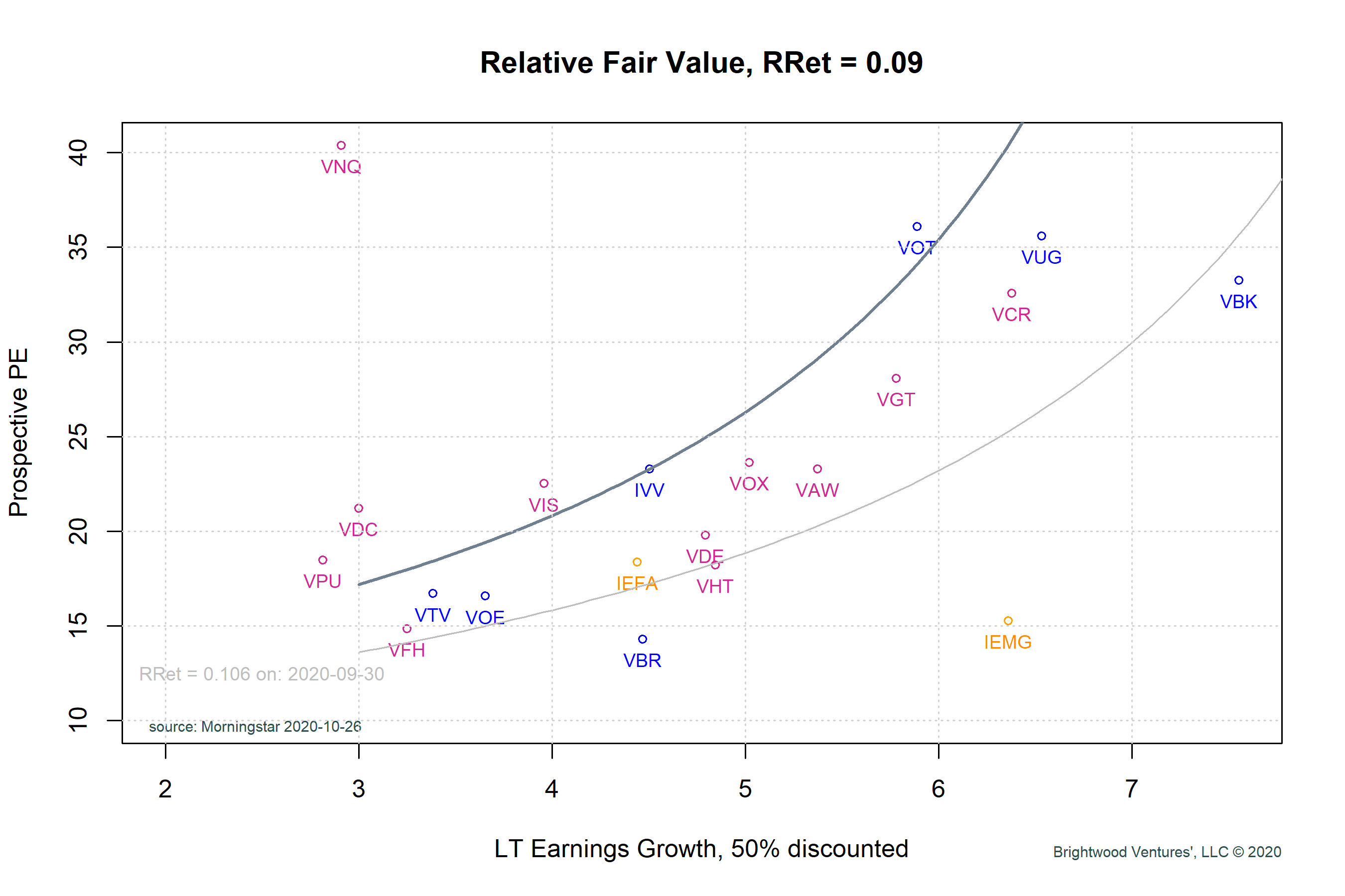
Next, I use a discounted earnings model and assume that the S&P 500 is priced fairly. So, we can now look at other sectors relative to the S&P 500. Once we have this plot, we can make some simple assumptions about the rate of return investors seem to be requiring for a given level of growth.
The growth numbers for this chart come from bottoms up earnings estimates and aggregated by Morningstar. I cut the estimates in half, because forward earnings estimates always start high and go through downward revisions.
Observations:
1) As a general rule, most all of the PE ratios on this slide are up from last year. We are paying more for earnings this year. To be fair, earnings are expected to fully recover next year and we’ll get to that in a moment. Even if earnings hit forecasts next year the PE is high relative to historical, but given discussion on interest rates explainable.
2) Generally, long term growth expectations have fallen from prior year expectations. International developed market earnings have actually come up slightly.
3) Growth stocks have been on a tear this year. We can see from the chart that large growth (VUG), consumer (VCR) and midcap growth (VOT) are all above PE 30.
RELATIVE VALUE
As we can see, the market is pricing in growth expectations and the various funds are largely tracking the shape of the curve.
That said, given the economic conditions and the stretched PE ratios on high growth (VUG, VOT) and consumer discretionary (VCR), I tend to underweight here. Mid- cap value (VOE) is below the line and the growth expectations are low. For this reason, I favor overweighting here. As well, large cap growth (VTV).
In terms of sectors, healthcare (VHT) looks quite attractive. Technology (VGT) growth is good and valuation is in line with the valuation curve. I continue to like the two asset classes paired because they tend to be non-correlated over longer periods of time.
What about international? On a relative value, developed international has seen PE appreciation but less so then the US. Also, growth expectations have been more stable. For this reason, I would be increasing allocation to International developed. Arguable, from a pure valuation perspective, emerging markets look attractive from a value and growth perspective (IEMG). However, emerging has been a consistent under-performer for years. Largely, I believe this is due to consistently missing growth and earnings forecasts.
CONCLUSION
Interest rate policy and stimulus have driven asset prices up and future return expectations down for both stocks and bonds. Long-term bonds do not appear to be rewarding investors for the extra interest rate risk they are taking.
Stocks across both international and US markets are pricing in full earnings recover by 2021. The PE ratios are stretched but given compressed interest rates the multiple expansion is explainable.
Heading into 2021, I am repositioning to further reduce bond duration and shift toward the sectors discussed in the relative value analysis.
ADDITIONAL DETAILS
For those who would like to see some additional data I have inserted two tables, one for US sectors and one for stock funds. The data is a few weeks old but may be interesting.
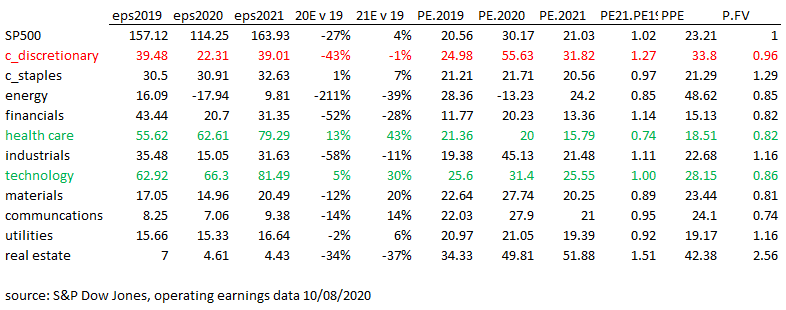
eps: earnings per share
PE: price to earnings ratio
PPE: price to prospective earnings for 2020
P.FV: price to fair value, given assumptions of growth and current PE
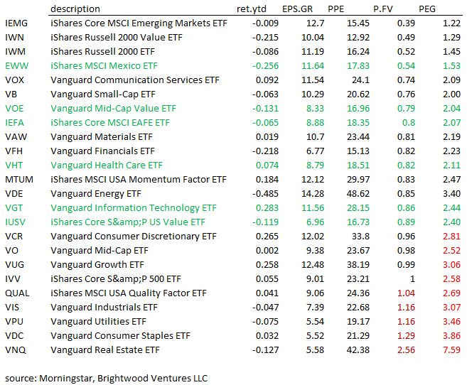
ret.ytd: return year to date
EPS.GR: earnings per share growth estimated over 3-5 years
PEG: price to earnings growth ratio