
• The Market correction last week was the fastest on record
• Historically, the average return over the next year from 5% drop is +12%
• When the market value is ‘fair’ at the drop, the next year is +17.3%
• If history is a guide, selling into the drop my not be prudent; for new investments average in.
Today I’d like to take a look at prior market shocks (any case where the market declined more than 5% from the peak). There are some interesting lessons from this data that may help guide expectations going forward. It’s always better to build our strategies on data rather than on emotion.
Fear set in last week with the VIX rising to almost 50 last Friday. Since 1990, this has only occurred twice previously, in 2008-2009 and in 2015. The fear in 2015 was driven by global growth slowing and a sharp decline in oil prices to $37 a barrel. Today the market is up over 2.2% at mid-day. So clearly, market participants are unsure about the future impact of the Coronavirus.
Let’s talk about our market playbook pre- and post- correction.
Pre- Correction Playbook
First, for long term money we have been invested with tilts toward the US and to equity funds and stocks that have higher quality earnings and more of a defensive posture. The real earnings yield (discussed here), is a measure of the earnings yield of stocks above inflation. At 1.5%, we were in ‘caution’ territory. At 1%, our valuation models would signal it’s time to raise cash. So, for long-term investments we were neutral weight on equities with a somewhat defensive strategy. For new money, given valuations, we were in ‘dollar cost averaging’ mode.
Historical Data
Now we are at the beginning of the Coronavirus event and from peak the market was down 12.75%. Currently, from peak the decline is ~ 10.75%. For the year, currently we are down approximately 6.5%.
Since 1980, we have had 51 drops from peak over 5%. So, drops of 5% are pretty frequent, happening roughly every 10 months. Of the 51 cases, 18 of those went on to be drops of more than 10%. Given the history of drops, what can we say about whether selling is a good idea?
In the graph below, I took the 51 times the market declined 5% or more and plotted each case. I plotted the market from 66 days before the 5% drop and 264 days after the drop. This is roughly 3 months back and 1 year forward.
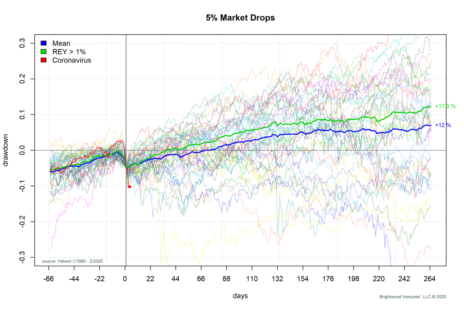
The dark blue line on the graph is the average of all of the market paths from the drop. From the point of a 5% drop, we see that on average the return over the next year is up 12% from the drop point. If we simply went by averages we would say it is better to hold shares and not sell. However, the picture gets quite a bit more interesting.
If we take into account the market valuation using the real earning yield we get some interesting insights. If we look at the real earnings yield at the point of the drop, in 75% of the cases the market real earnings yield was > 1%. In 25% of the cases, the real earnings yield was below 1%. In the graph, I have plotted a green line for the average return in cases where the market was not over-priced. We can see that this average generated a 17.3% average return from the drop point over the next year. Furthermore, on average the market returns to peak value in roughly 30 days (almost twice as fast as average case).
It is also interesting to note that whether we look at the blue or green lines, the average bottom is very close to the initial drop point. Yes, there are some cases where the drop continues to get worse. However, the biggest single determinant for how big of a drop will occur is strongly related to the market valuation at the time of the drop. I don’t like the idea of selling into a panic. I think the more prudent approach is to be positioned with the right level of risk before panic sets in. To do this, the real earnings yield is one of the critical metrics.
Post- Correction Playbook
Given our strategy going into the correction and armed with the historical data above, what is the strategy? I am not selling equities at this point. For those who have cash for new investments, I would recommend holding until the VIX drops below 20, look for price support in the market and consider dollar cost averaging. Please note, do not take this as investment advice. Each person’s situation is unique and the ideas here are my baseline model. This model is then tailored for the individual situation.