
One of the most common questions I get asked is along the lines of, ‘what do you look at to figure out if the market will go down?’. We can’t say with certainty any month will be up or down. The main problem is timing. Let’s take a simple example. Stock market PEs peaked above 30 prior to the year 2000 decline. The long term PE average is about 15. However, PE ratios had been above the average for most all of the 7 years leading up to 2000. Timing the exact month or quarter the market will decline is very difficult. Staying out of the market entirely from 1993 – 2000 would have been a pretty big mistake.
Because timing is so difficult, my approach to building model portfolios is to start with a diversified portfolio that includes stocks and bonds and then ‘tilt’ the portfolio to an equity position with more or less weighting based on conditions. For example, in cases where stock prices are very high relative to bonds and where other warning signs are present, we may cut back on equity allocation.
The signals we will cover do not guarantee a market decline. The best way to think about these signals is that they increase the probability of a market decline. In addition, a combination of the signals has more meaning than any one signal on its own. For this reason, a good deal of judgment is required.
Stocks Overpriced
Signal: Yellow
When stock prices become too high, a stock’s future returns goes down. How do we measure it? The best measure I have found is the real earnings yield. A complete discussion of the real earnings yield can be found in this post. https://www.brightwoodventures.com/rey-real-earnings-yield-valuation-model/ To summarize, real earnings yield is essentially the earnings of a company divided by the price we pay for the earnings and then subtract inflation. Think of real earnings yield as the return we could expect if every dollar of earnings was paid directly to shareholders after inflation. When the real earnings yield of the stock market falls below 2% we should become more cautious. When the real earnings yield falls below 1%, this is a clear signal that a large decline is more likely. Using the trailing PE ratio of 25 and inflation of 2.5% the real earnings yield is roughly 1.5%. This puts us into cautious territory.
Economy Overheating
Signal: Green
Assume that stock market prices already reflect the growth rate of the economy, interest rates and inflation. Some believe that the change in rates matters more than the current rate, so look at acceleration and deceleration. Recently I tested stock sector performance one quarter out. I looked at the four combinations of real GDP and inflation acceleration and deceleration. In the case where the real GDP is decelerating and inflation is accelerating, most all segments tended to have negative returns over the next quarter. Let’s think about this for a minute. As the economy comes out of recession and into expansion, earnings should grow and even accelerate. As earnings grow, stock prices follow. As the cycle nears the end, we would imagine stock prices are up. But if the economy overheats and inflation shows up, we can expect that the Federal Reserve will raise rates. There are three problems with this. First, increasing rates will cause the economy to slow and earnings will decline. Prices suffer. Second, higher interest rates lead investors to demand higher return because bonds look more attractive. Finally, inflation erodes real return, and as we noted, declining real returns are bad for stocks.
Q2 GDP was 4.2%. The current Atlanta Fed GDP forecast is now 4.4%. Based on this measure, GDP is accelerating. Some argue we can expect the economy to slow. Watch housing, materials, heavy equipment and aircraft orders as some see weakness here as a signal to declining GDP. As for inflation, the August reading was 2.7%. In June, the reading was 1.55%. Inflation is accelerating. With GDP accelerating and inflation accelerating the model is inconclusive. Keep an eye on GDP results. Any decline in GDP growth will turn this signal red.
Credit Market Signals Fear
Signal: Green
The Federal Reserve is now using ‘excess bond premium’ as a variable to forecast recessions. Excess bond premium (EBP) can be simplified. Basically, the excess bond premium measures the amount or return investors demand for corporate bonds (sometime referred to as credit bonds) over government bonds. The idea here is that investors will expect higher interest rates if they become fearful that the economy may decline. When the economy is running smoothly, companies have enough earnings to pay the interest on the bonds they have issued. However, if the economy slows and earnings dry up, there is risk (especially with weak companies) that they may miss their bond payments (default).
The Federal Reserve publishes EBP data, but the data is updated infrequently. As it turns out, we can get a very good idea of what EBP is by looking at junk bond ETFs. For example, iShares JNK is currently yielding 5.42%. With 10-year treasuries yielding 3%, this is a spread of 2.42%. If JNK bond prices drop suddenly (increasing the interest rate), this would signal caution. At this point, the junk bond market is stable with the spreads below long-term averages.
Market Price Acceleration and Irrational Exuberance
Signal: Green
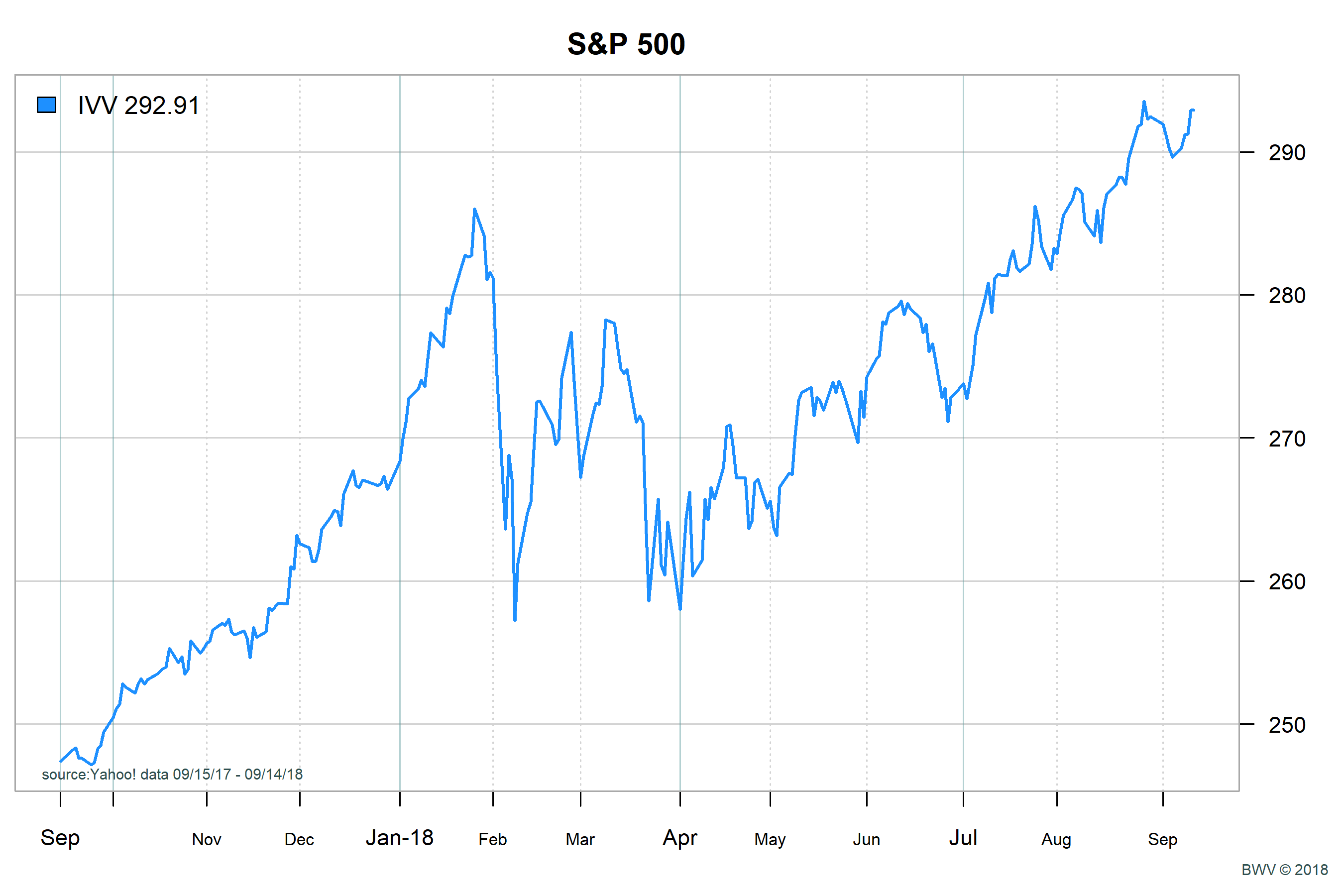
When stock prices accelerate rapidly and other signals are present, risk is elevated. To calculate stock price acceleration I look at roughly 4-5 months of stock price returns. The details behind the calculation go beyond this post. To get a sense of the acceleration, look at a one year chart for stock prices. If stock prices are going up, does the chart look smooth with a constant slope? Or does it look like the prices are rising at an ever increasing rate? One can see this by looking at the last full year of stock prices. In Jan of 2018, we see the slope of stock prices accelerating. Prices today are above the peak on Jan but the acceleration is lower. The market took a steep drop in the days following the large acceleration in January.
Short Term Timing, Stock Prices Declining vs Treasury Bonds
Signal: Green
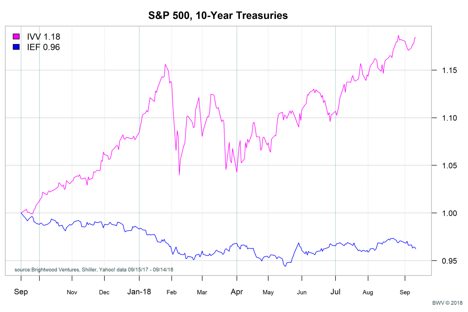
When fear grows in the market, investors shift from stocks to bonds. We get a sense of this by looking at relative performance of the S&P 500 compared with ten year treasury notes. From the chart below, we can see that the S&P 500 has been outperforming 10-Year treasuries in recent months (measured by the ‘IVV’ S&P 500 index ETF vs. the Intermediate Gov’t Bond ETF ‘IEF’). In particular, note that over the last month bonds have declined in price (rates are increasing). This chart does not show much fear finding its way into the bond market.
Extreme Consumer Optimism
Signal: Green
As the economy accelerates, consumer confidence goes up. If confidence takes a sharp decline from highs, this can be a warning. The University of Michigan Consumer Sentiment Index tracks the outlook of US consumers on the economy. From the graph below, note the large decline in sentiment that occurred prior to the recessions in 2000 and 2008. It is important to note that the decline can happen months before the declines.
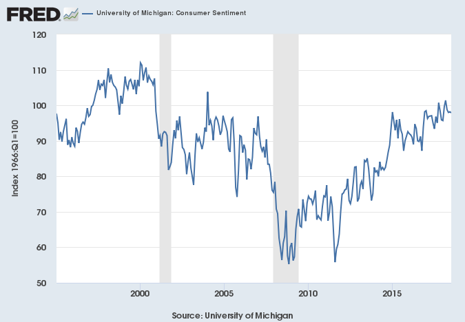
source: Federal Reserve Bank of St. Louis link
VIX, The Stock Market Fear Gauge
Signal: Green
The CBOE VIX index is a measure of market risk. The measure is derived from option prices and is scaled to measure the expected future volatility of the market assuming an annualized period. From the graph, we can see that before the recessions of 2000 and 2008, the VIX rose sharply above 20. The signal is quite noisy and as a result, this gauge should be considered together with other signals.
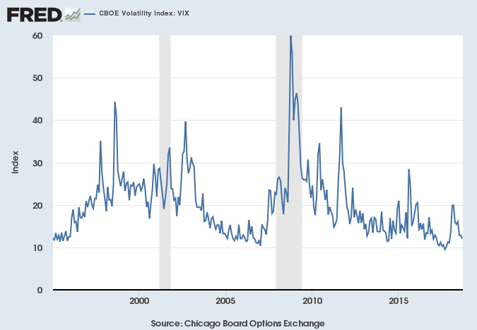
source: Federal Reserve Bank of St. Louis link
Conclusion
Based on the seven signals, we see that only the first is flashing a warning sign. Stock prices based on past earnings are generating a real earnings yield below 2%. Still they are above the 1% level that I would consider a red flag.
In addition, the other six indicators are not indicating high risk. These things could change rapidly and in parallel. The thing that stands out to me is that we are nearly 8 years into the recover since the financial crisis. The Fed is raising rates. We are much closer to the end of the business cycle then the beginning.
Although all of the signals have some value, I am particularly focused on how earnings growth and inflation are moving.