
Economic charts may be as boring as they come… but not this one. Below we have a chart of US Real Disposable Income. Pandemic aid and enhanced unemployment payouts took what was a steady 2.6% growth over the last 10 years and generated a big shock up in income.
Here we see massive pandemic aid (fiscal stimulus) flowing into Real Disposable Income. Year over year growth for March 2021 was close to a 30% spike! Most of the money was spent, some was saved. Savings rates increased dramatically to around 25%. Is it any wonder that we are seeing pricing pressure on all types of goods and services? Is it any wonder there was a surge of day trading stocks, crypto-currencies and SPACs?
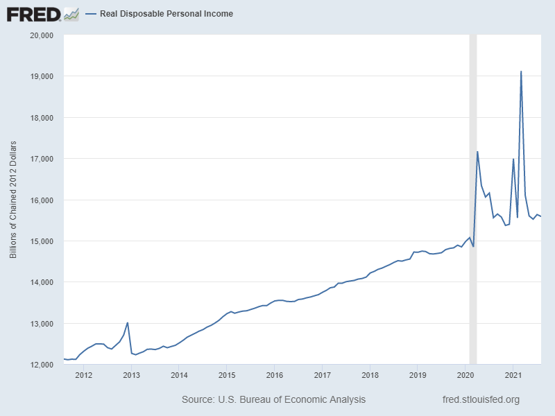
The shock in disposable income is unlike anything we have ever seen. Is it any wonder that the Federal Reserve and economists are grappling with the issue of how long inflation will last? Consumers were feeling pretty confident and spent money on home improvements, cars, new homes… So just as we got a reduction in supply as shipping and production slowed last year, the consumers were out driving demand up. If we remember anything from economics class it is the supply and demand curves. When the demand curve goes up and the supply curve goes down, what happens? Less goods are sold and prices go up.
It has been such a huge shock to the system that I’m going to argue that we really need to have a bit of patience to see how things are going to work themselves out. Incomes are returning to ‘normal’ and we are now left with trying to figure out how long it takes for inflation, savings rates and employment to return to normal. We don’t have any historical models to guide us. So let’s wait and see.